Trackit.fit
Trackit.fit is a web-based fitness platform that helps users track workouts, nutrition, hydration, and overall progress. Through research and user feedback, we identified three areas with the greatest opportunity to improve usability and engagement: Progress Photo Tracking, Hydration Tracking, and an enhanced Nutrition System that includes meal planning, recipes, and macronutrient guidance.
Feature Addition
Early research revealed gaps in how users tracked progress and maintained daily habits. While core functionality existed, it didn’t fully support long-term consistency.
Key opportunities included:
Helping users visually understand progress over time
Making hydration tracking easier to maintain day to day
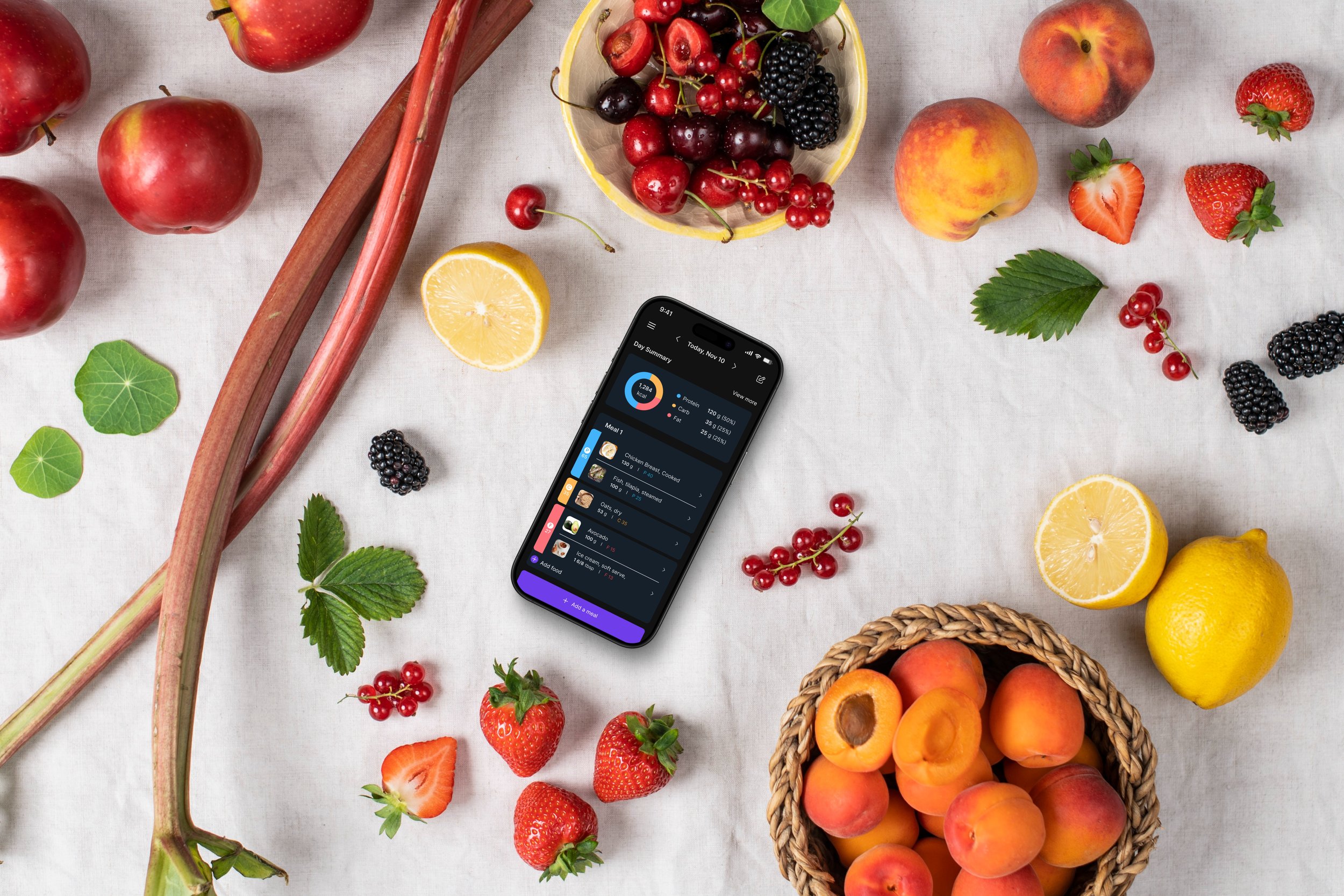
Turning nutrition tracking into a planning tool rather than just a log
These insights shaped the direction for all feature improvements..
My Role
Timeline: 3 Months, August 2024-November 2024
Team: UX/UI Designer (Myself), Development Team, Product Management and CEO.
View Live Website

Overview
The goal of this project was to help users stay consistent with their fitness habits by making progress easier to see and daily tracking easier to complete.
We focused on:
Clear, visual progress tracking
Habit-friendly hydration logging
Simple, structured nutrition planning
Across all features, the priority was clarity, ease of use, and long-term engagement.
Research and Discovery Phase:
We conducted interviews and surveys with existing and potential Trackit.fit users to uncover:
What workflows users found valuable
Where they struggled with current tracking
Expectations for advanced features
Key insights:
Visual progress comparisons were motivating and encouraged consistency
Users needed customizable reminders and insights to form hydration habits
Nutrition planning without structure felt overwhelming
Research was anchored in user goals, not just methods — we chose interviews and surveys to understand why users behaved as they did, not simply what they did.
User Interviews
During user interviews for Trackit.fit, we faced challenges like recruiting diverse participants, scheduling conflicts, and users having trouble expressing their needs. To overcome this, we used follow-up questions and guided discussions to dig deeper. Despite the hurdles, the research uncovered key user needs that informed our design:
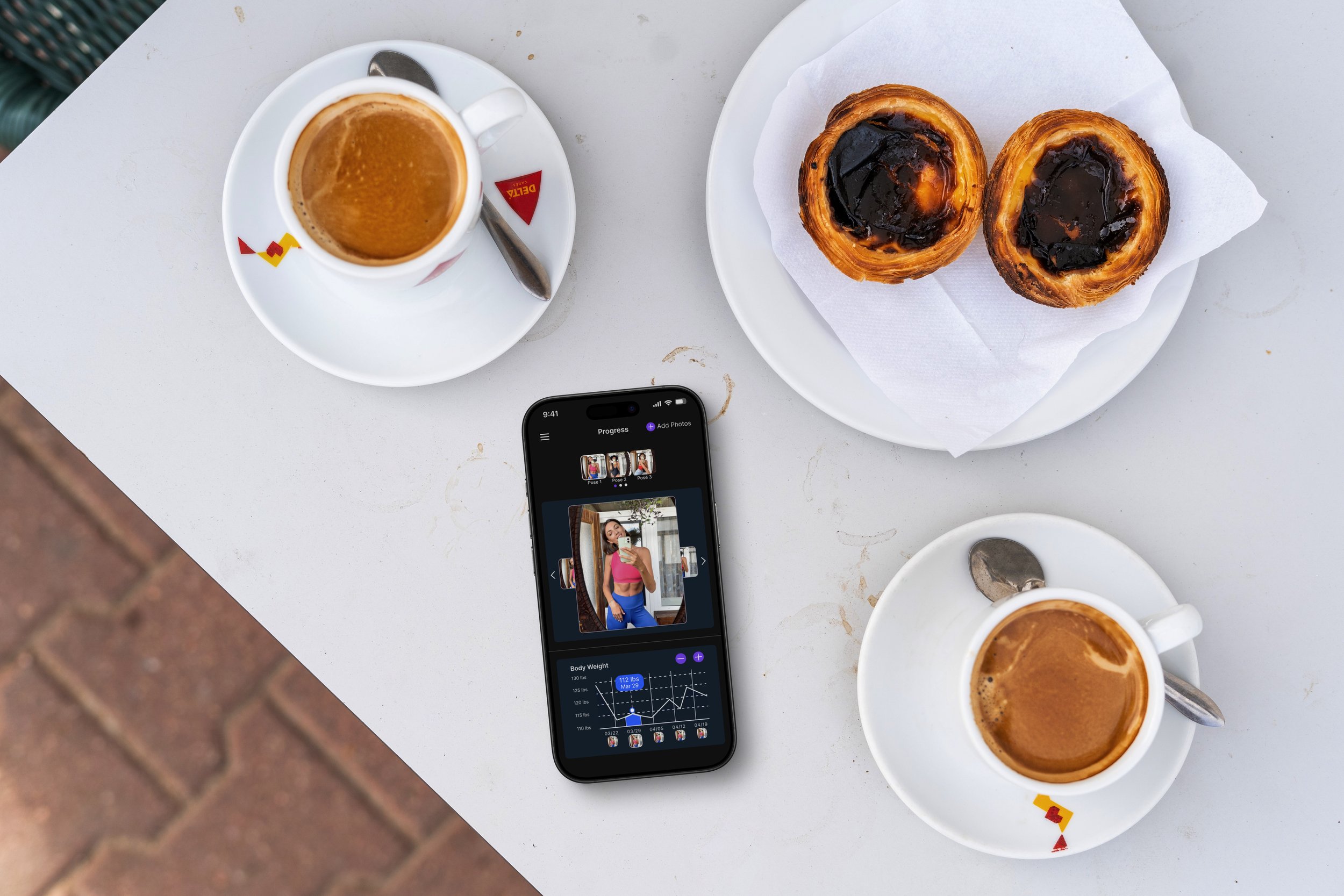
Progress Photo Tracking: Users wanted an easier way to organize and compare their progress with better sorting and side-by-side views.
Hydration Tracking: Many struggled with consistency, asking for more intuitive reminders, progress insights, and adjustable daily goals.
Nutrition System: Users needed structured meal plans, recipe suggestions, and clearer macronutrient tracking to simplify diet planning.
These insights became the foundation for refining the features, creating a more intuitive and engaging experience for users.

User Survey
Surveys were crucial for gathering broad user feedback, helping to identify pain points and validate assumptions about user challenges.
Progress Photo Tracking: Users expressed a need for improved organization, the ability to view side by side comparisons, and clearer timelines to track visual progress.
Hydration Tracking: Users reported difficulty maintaining consistency and requested smarter reminders, customizable goals, and insights into their daily hydration progress.
Nutrition System: Users desired structured meal plans, recipe suggestions, and simplified macronutrient tracking to streamline their diet planning.
User Personas
User personas represented a wide range of fitness enthusiasts, from beginners looking for guidance to more experienced users focused on tracking performance. Across all groups, users felt overwhelmed by the amount of data on the site and found some features difficult to navigate. Beginners struggled to find the right tools and understand their progress, while advanced users wanted greater control and more customization options.
Competitive Analysis
Analyzing apps like Cronometer and MyFitnessPal helped identify:
Strengths we could emulate (nutrient breakdowns, community features)
Gaps we could innovate (clear visual progress, simplified workflows)
This ensured our solutions were not just novel but valuable relative to expectations.
Flowchart
By mapping out the user journey from entry to task completion, the flowchart allowed us to identify key touchpoints and potential friction points in the navigation. A breakthrough came when the team adopted a minimalist approach, stripping down flows to their simplest forms. For example, the progress photo feature was streamlined to allow users to upload, tag, and view their photos in a timeline with just three taps. This clarity ensured a smoother user experience, aligning with the app’s mission to simplify health tracking. Key findings included areas where users experienced confusion or delays, which led to simplified paths and clearer labels. This helped us optimize the site’s layout, making it easier for users to access essential features and enhancing overall usability and satisfaction.
Initial Design
The initial Trackit.fit design focused on Progress Photo Tracking, Hydration Tracking, and the Nutrition System, guided by insights from surveys, interviews, and competitive analysis. This version prioritized:
Progress Photo Tracking: Inspired by photo album layouts, early sketches balanced aesthetics and function, allowing for better organization and side-by-side comparisons.
Hydration Tracking: Designed with simple progress indicators and smart reminders to help users stay consistent.
Nutrition System: Structured meal plans and clear macronutrient tracking for easier diet management.
Wireframes and low-fidelity prototypes established an intuitive flow for quick access to these key features. Early user testing revealed usability gaps, leading to iterative refinements to enhance clarity and efficiency.
Wireframes
The wireframes were the simple layout for the Trackit.fit website, making user ideas easy to see. I began with quick drawings showing key parts like tracking progress, navigating the site, and adding photos. These drafts let us test ideas fast and get feedback from the team, ensuring we met user needs and business aims. We then focused the wireframes on one feature at a time, such as a water tracker that visually updated as users logged their intake, making the site clear and engaging. These changes helped the app work well for everyone, from beginners to experienced users.
User Feedback
Through surveys, interviews, and usability tests, we identified key user needs and pain points that shaped our design decisions.
Progress Photo Tracking: Users wanted clearer visual cues for progress, leading to more prominent comparison tools and an improved timeline view.
Hydration Tracking: Feedback highlighted the need for better reminders and goal customization, prompting enhancements to progress indicators and daily tracking insights.
Nutrition System: Users sought a more personalized experience, inspiring the integration of structured meal plans, recipe recommendations, and macronutrient breakdowns.
A major moment came when users emphasized the need for stronger visual indicators of their fitness progress. This led to more intuitive data visualizations and streamlined tracking across all three features.

Early Prototypes
User Engagement
Ensuring long-term engagement required more than just functionality. Users wanted progress photo tracking to feel rewarding and the hydration tracker to inspire consistency. Gamification was tested, but it felt gimmicky. Instead, subtle motivators like weekly progress highlights and personalized tips were introduced. These changes resonated with users, who appreciated the app’s role as a supportive partner rather than a taskmaster.
Design System
Throughout this project:
We used a consistent design system to maintain visual and interaction patterns across features
Collaborated closely with developers to ensure feasibility and pixel-perfect implementation
Provided annotated designs and specifications to reduce implementation rework
Final Designs
The final Trackit.fit design made it easy and enjoyable to use, thanks to what users told us. The website was set up to help people track workouts, see their progress, and connect with others without any fuss. It was important to have many features but keep things simple. So, we tested different versions and made changes to make sure everything was clear and easy to find. By working together with the team, we created a design that looks good on any device and puts users first.
Results & Impact
Increased engagement in progress tracking, with more users consistently uploading and reviewing photos.
Higher adoption of meal planning features, making nutrition tracking more seamless.
Improved retention in hydration tracking, with users sticking to their goals more effectively.
Conclusion
This project was a testament to the power of user-centered design and close collaboration across teams. Enhancing Trackit.fit’s features addressed user pain points and drove engagement, making health tracking a seamless, enjoyable experience. The progress tracker helps users visualize their journey over time by organizing and comparing photos in a clear, chronological timeline, enabling them to track and celebrate their personal growth. The hydration tracker used intuitive visuals like a refillable water glass icon, and the nutrition system combined meal logging with insightful trends. User testing revealed a sense of delight and relief—users could now track their health comprehensively without juggling multiple apps. The challenges faced throughout the process ultimately shaped a product that was intuitive, engaging, and aligned with user needs.
What I Would Do Differently
Make Progress Dashboards More Customizable – Let users choose who sees their progress and what details they share.
Enhance Feedback & Comments – Add threaded conversations and emoji reactions to boost interaction.
Improve Goal-Setting & Check-Ins – Introduce smart reminders and streaks to keep users engaged.