Designing Clarity in Healthcare AI
An AI Copilot that reduces cognitive load and helps clinicians act faster with confidence.
Healthcare teams don’t struggle because they lack data. They struggle because making sense of that data takes too long. This project focused on turning fragmented, high-volume information into clear, actionable insight—without disrupting how clinicians already work.
Impact
↓ 14% task friction
↑ 22% workflow efficiency
92% user confidence in AI-assisted decisions
The Problem
In practice, clinicians were forced to navigate multiple disconnected systems—patient records, notes, alerts, and reports—just to understand a single situation. Important details were often buried, duplicated, or presented without clear priority.
That created a consistent pattern:
Time lost searching instead of acting
Mental fatigue from piecing together context
Risk of missing critical information
The issue wasn’t access to data. It was the cost of understanding it.
My Role
Timeline: 3 Months, August 2024-November 2024
Team: UX/UI Designer (Myself), Development Team, Product Management and CEO.
View Live Website

Research & What Changed My Thinking
I led discovery across users, workflows, and internal stakeholders to understand where breakdowns were happening.
Methods
Interviews with healthcare professionals
Workflow mapping and task analysis
Competitive review of AI-assisted tools
Internal sessions with PMs, engineers, and domain experts
What stood out immediately
“I don’t read everything. I scan and move.”
“If I can’t trust it, I ignore it.”
“Switching tools is where I lose time.”
At first, it was tempting to think better aggregation would solve the problem. It didn’t.
Key insight
The real need isn’t more information—it’s faster understanding.
That shifted the goal from organizing data to reducing thinking effort.
Reframing the Opportunity
Instead of designing another tool, the focus became:
How might we surface the right information at the right moment, inside the workflow, without adding friction?
This reframing changed everything. The solution wouldn’t live as a destination—it had to exist within the flow of work.
Exploration (Low-Fidelity)
I explored multiple directions quickly to test different mental models before committing.
1. Dashboard-Centric: Pulled everything into a single view.
Strength: Visibility
Problem: Required users to leave their workflow
2. Conversational AI: Let users ask for what they need.
Strength: Flexibility
Problem: Too slow and unpredictable for real-time decisions
3. Embedded AI (Selected) Layered insights directly into existing workflows.
Strength: Minimal disruption, immediate value
Tradeoff: Required strong prioritization and restraint
The third approach aligned with how users already behaved: scan quickly, act immediately.
Usability Testing
I tested early concepts with a focus on speed, clarity, and trust.
What I evaluated
How quickly users could find key information
Whether AI outputs were understandable
Confidence in making decisions
What I learned
Users skipped anything that felt like extra work
Dense outputs reduced trust instantly
Clear hierarchy dramatically improved speed
This led to a principle that guided every decision after:
If it doesn’t help the user act, it shouldn’t be there.

Iteration (Where the Product Took Shape)
The solution improved through focused iteration.
V1 — Raw AI Output
Unstructured summaries
Result: Hard to scan, low trust
V2 — Structured Blocks
Grouped information with hierarchy
Result: Better, but still too heavy
V3 — Clinical Copilot
Prioritized insights
Clear visual hierarchy
Action-oriented summaries
Result: Fast, usable, and trusted
Each version removed noise and increased clarity. The breakthrough wasn’t adding features—it was deciding what not to show.
A/B Testing (Validating Decisions)
To remove guesswork, I validated key patterns through A/B testing.
Tested
Dense vs. minimal summaries
Inline AI vs. separate panel
Highlighted insights vs. full explanations
Results
Minimal summaries → faster task completion
Inline AI → less context switching
Highlighting → better comprehension
These weren’t stylistic choices—they directly impacted usability and speed.
Final Solution — The Clinical AI Copilot
The final experience is a lightweight AI layer embedded directly into the workflow.
It helps users:
Understand complex data instantly
Identify risks and changes at a glance
Take action without leaving context
The design works because it respects how clinicians already think and operate. It doesn’t ask them to learn something new—it supports what they already do.
Design System (Supporting Clarity)
In a high-stakes environment, visual design needed to reduce noise—not add to it.
Principles
Clarity over decoration
Hierarchy over density
Consistency over novelty
System
Muted palette with intentional highlights
Strong typography scale for scanning
Modular card system for flexibility
Every visual decision reinforced speed and comprehension.
Collaboration (Making It Real)
This wasn’t solved in isolation.
Product Managers
Aligned with what mattered most
Helped prioritize speed vs. depth
Engineers
Partnered early on feasibility
Iterated with real constraints, not assumptions
UX & Stakeholders
Continuously validated decisions
Provided domain expertise
My role was connecting all three—making sure what we built was useful, usable, and possible.
This wasn’t solved in isolation.
Product Managers
Aligned on what mattered most
Helped prioritize speed vs. depth
Engineers
Partnered early on feasibility
Iterated with real constraints, not assumptions
UX & Stakeholders
Continuously validated decisions
Provided domain expertise
My role was connecting all three—making sure what we built was useful, usable, and possible.
Using AI Thoughtfully
AI was part of both the product and the process.
In the product
Summarization
Insight prioritization
Decision support
In the design process
Faster synthesis of research
Rapid exploration of ideas
Iteration support
Used carefully, AI accelerated the work—but never replaced judgment.
Results
The final product delivered measurable improvements:
-14% reduction in task friction
+22% faster workflows
92% user confidence
More importantly:
Users trusted the system
Adoption increased
Cognitive load decreased
The product didn’t just work—it fit.

Early Prototypes
User Engagement
Ensuring long-term engagement required more than just functionality. Users wanted progress photo tracking to feel rewarding and the hydration tracker to inspire consistency. Gamification was tested, but it felt gimmicky. Instead, subtle motivators like weekly progress highlights and personalized tips were introduced. These changes resonated with users, who appreciated the app’s role as a supportive partner rather than a taskmaster.
Design System
Throughout this project:
We used a consistent design system to maintain visual and interaction patterns across features
Collaborated closely with developers to ensure feasibility and pixel-perfect implementation
Provided annotated designs and specifications to reduce implementation rework
Final Designs
The final Trackit.fit design made it easy and enjoyable to use, thanks to what users told us. The website was set up to help people track workouts, see their progress, and connect with others without any fuss. It was important to have many features but keep things simple. So, we tested different versions and made changes to make sure everything was clear and easy to find. By working together with the team, we created a design that looks good on any device and puts users first.
Results & Impact
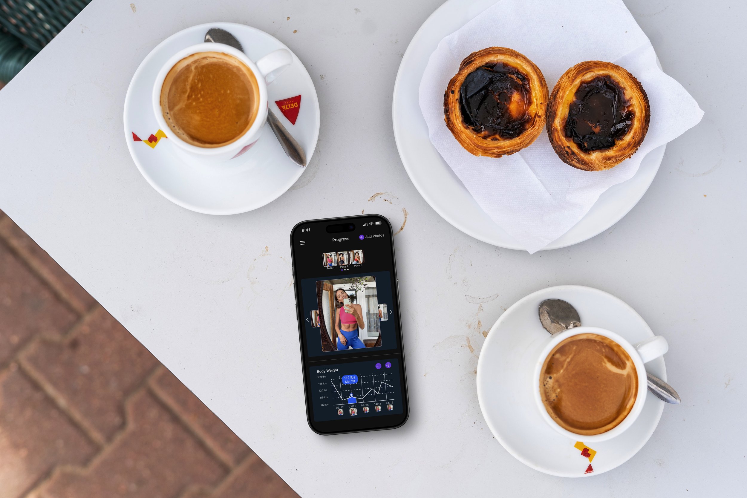
Increased engagement in progress tracking, with more users consistently uploading and reviewing photos.
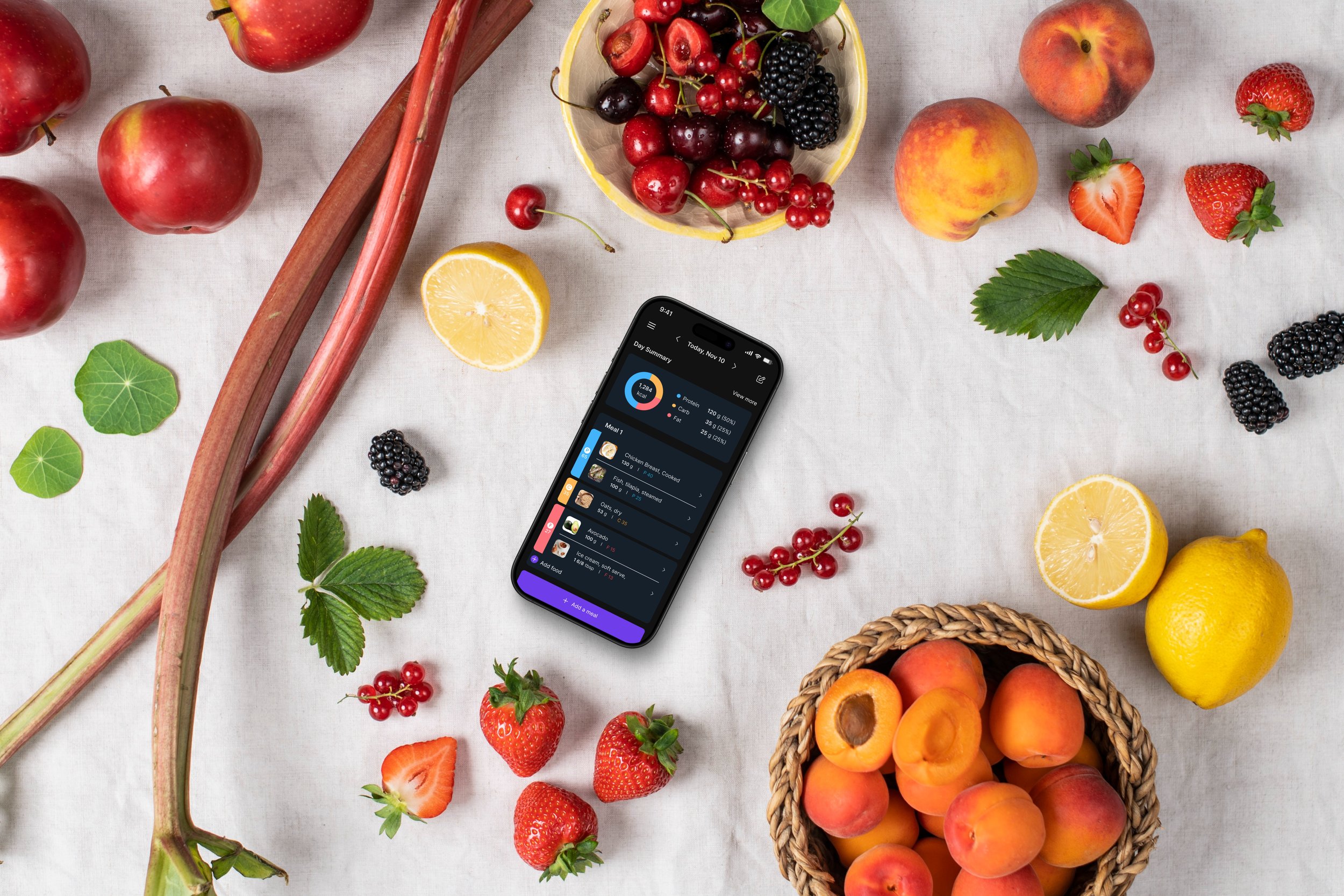
Higher adoption of meal planning features, making nutrition tracking more seamless.
Improved retention in hydration tracking, with users sticking to their goals more effectively.
Conclusion
This project was a testament to the power of user-centered design and close collaboration across teams. Enhancing Trackit.fit’s features addressed user pain points and drove engagement, making health tracking a seamless, enjoyable experience. The progress tracker helps users visualize their journey over time by organizing and comparing photos in a clear, chronological timeline, enabling them to track and celebrate their personal growth. The hydration tracker used intuitive visuals like a refillable water glass icon, and the nutrition system combined meal logging with insightful trends. User testing revealed a sense of delight and relief—users could now track their health comprehensively without juggling multiple apps. The challenges faced throughout the process ultimately shaped a product that was intuitive, engaging, and aligned with user needs.
What I Would Do Differently
Make Progress Dashboards More Customizable – Let users choose who sees their progress and what details they share.
Enhance Feedback & Comments – Add threaded conversations and emoji reactions to boost interaction.
Improve Goal-Setting & Check-Ins – Introduce smart reminders and streaks to keep users engaged.